
In a team of three, We have several meeting in order to understand stockholder needs and concerns.
In 2 meetings, we jointly developed brand attributes, target groups and corporate goals. It is not the goal to have extensive discussions or to develop a perfect solution, but to make quick decisions, to get commitment and to be able to act strategically despite limited time and budget.
Project Overview


Role
Team
Time Scope
Tools

Methods
UX/UI Designer
Group of 3
8 Weeks
Figma
Illustrator
Google meet
Zoom
Photoshop
Canva
heuristic evaluation
User Journey
Competetive analysis
Sketching
Wireframes
Prototyping
Usability Testing
A/B Testing
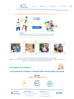
Target Audience
Families
Friends and Couples
Individuals:
Corporate Groups
Seniors
Young Adults
Event Planners
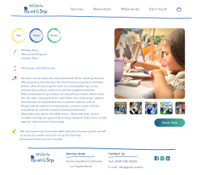
By addressing the market needs and targeting a diverse audience, the redesigned Paint and Sip website has the potential to attract a wide range of customers, making it a versatile and inclusive platform for creative expression and social engagement.
1. Lack of Online Booking:
The existing website did not offer online booking options, requiring customers to make reservations through phone calls or mail.
2. Inefficient Reservation Process:
The manual booking process was time-consuming and inconvenient for both customers and staff.
3. Limited Accessibility:
Potential customers, especially those from younger generations, prefer online booking for its convenience.
4. Missed Revenue Opportunities:
The absence of online booking may have resulted in missed revenue opportunities, as potential customers could be deterred by the lack of a user-friendly booking system.
Pain Points
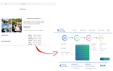
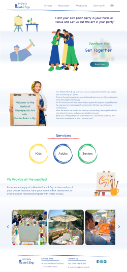
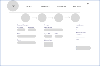
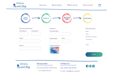
1. Implement Online Booking System:
Develop and integrate a user-friendly online booking system into the website to enable customers to reserve Paint and Sip sessions effortlessly.
2. Streamline the Booking Process:
Simplify the steps required to book a session, ensuring that customers can easily navigate through session selection, customization, and payment.
3. Mobile Accessibility:
Optimize the website and booking system for mobile devices, making it accessible to a wider audience.
4. User-Friendly Interface:
Redesign the website's interface to be intuitive and visually appealing, enhancing the overall user experience.
5. Clear Session Information:
Provide detailed information about each painting session, including dates, times, themes, and instructor details, to assist customers in making informed choices.
Solutions
KPI: Conversion Rate Improvement
Target: Achieve a minimum of 20% improvement in the conversion rate.
Rationale: The KPI measures the impact of the website redesign on the conversion rate, which directly reflects the effectiveness of the new online booking system. A 30% increase in customers suggests a positive impact, and a 20% improvement is set as a target to ensure sustained growth and user satisfaction.
Monitoring: Regularly monitor website analytics and booking data to calculate the conversion rate improvement. Analyze this KPI over time to ensure the continued success of the project.
This KPI provides a clear and measurable way to assess the success of the website redesign project, specifically focusing on the enhancement of the booking process and its impact on customer acquisition and engagement.
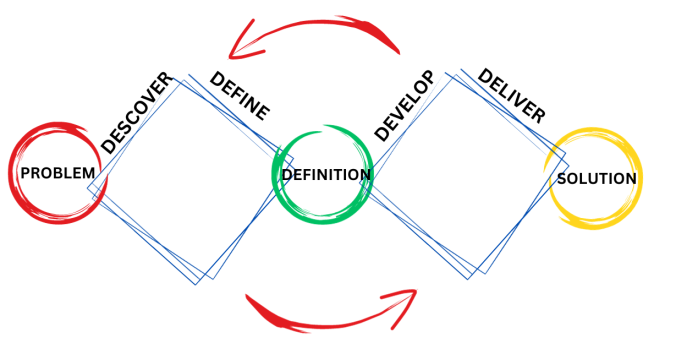
Design Process
Discover
Heurestic Evaluation
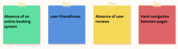
After finding some pain point from customer and stakholder vews we did a huristic evaluation to fin any hidden problem and in our comprehensive heuristic evaluation of the Paint and Sip website, several critical areas for improvement were identified.
Firstly, the absence of an online booking system was a notable drawback, as it hindered the user's ability to reserve painting sessions conveniently.
Proposal: providing online and intuitive booking system and users can completely do their reservation online.
Secondly, the website's overall user-friendliness needed enhancement, with a focus on optimizing the user experience to make it more intuitive and accommodating.
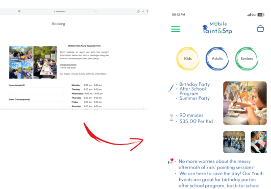
Proposal: We noticed that users have a hard time finding information about their suitable event and all the data is placed on the home page. Separating the sections related to adults, children and seniors from each other and segmenting the data related to each type of event on its own page made the site more user-friendly and improved accessibility.
Thirdly, user reviews were notably absent, which is a valuable resource for potential customers seeking social proof and insights into others' experiences.
Proposal: We provided a section related to the opinions of previous participants of the events.
Lastly, the ease of navigation between pages was identified as an issue, with room for improvements to ensure a smoother transition between different sections of the website. Addressing these findings will be pivotal in transforming the website into a user-centric platform that fosters ease of use, trust, and seamless booking experiences for all users.
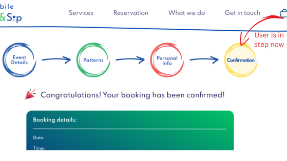
Proposal: As a UX designer and researcher, I suggested to the team to use the progress bar in a way that was interactive and showed the users which stage they are in and gave access to the users to navigate to the previous and next stages with one click, like breadcrumb but with the appropriate style of the website.
Competitive analysis
Our team analysed 6 competitors to find out what the designers of other companies pay more attention to and what features do they have compared to us that make the site design better and the user experience more efficient?
As conclusion:
Almost all of them didn't have:
Direct Booking
Most of them didn't have:
Pattern Selection
Is important to have:
Real Photos from their events
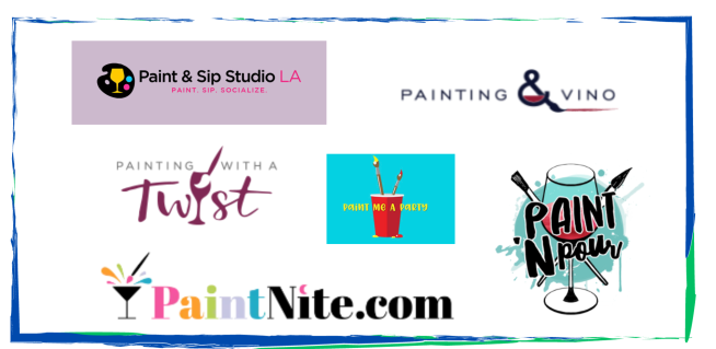
Wbsites Analyzed
Define
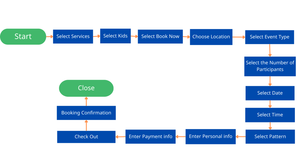
Journey Map
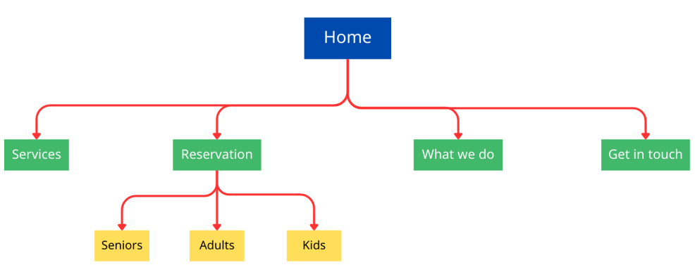
Site Map
Develop
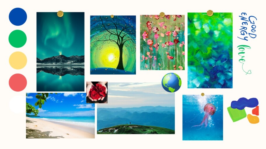
Mood Board
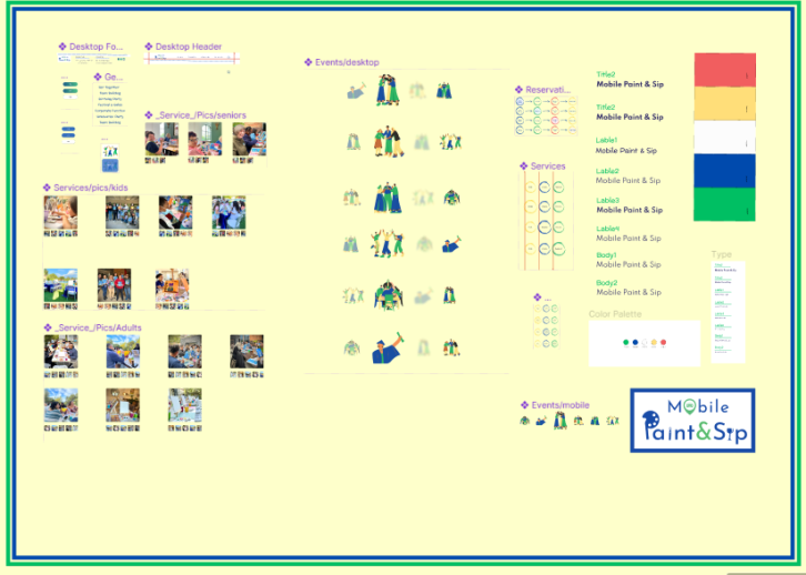
Design System & UI Kit
Low & Mid Sketches
Final Design
Deliver
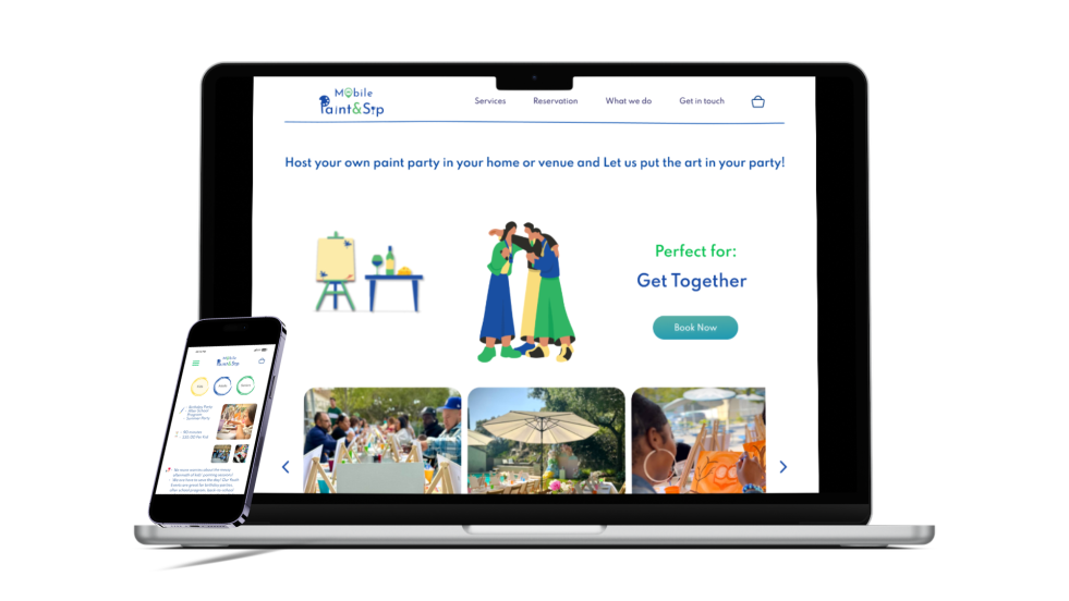
After the meeting with the owner and performing a few usability tests and appropriate interation, we prepared the final version and delivered it to the developer.
For a better understanding of the work process, our team had several meetings with the developer so that this part is completely aligned with design.
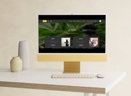
View Descktop Porototype
View Mobile Porototype
What did I learn?
What can we do next?
Collaborating closely with stakeholders, including team members, designers, and business partners, I learned the significance of clear and transparent communication in aligning project goals and ensuring everyone's input was valued.
I found that my background in business and market research allowed me to approach design decisions strategically. I was able to leverage this knowledge to redesign a user-centric website that not only addressed customer needs but also exceeded expectations, ultimately contributing to increased customer satisfaction.
This experience has reaffirmed the importance of multidisciplinary skills in crafting meaningful and impactful user experiences.
Usability testing and making sure that the new design meets the users needs in the best way.
have some meeting with developers to being sutre we are alighn and they can implement designs.
See more of my work

nasimmirzaei.work@gmail.com
.Always down to collaborate when I have the time
.Let's get in touch


