Nasim Mirzaei

Innoghte website redesign
Enhanced Usability: To create a navigation structure that simplifies the user journey, reducing the effort required to locate essential information.
Customer-Centric Approach: To reevaluate and revise menu item names based on customer preferences and expectations, ensuring alignment with their mental models.
Improved Accessibility: To make the website more accessible to a broader audience, including those with varying levels of technical expertise.
Approach
Project Task:
Redesigning Website Navigation for Enhanced Customer Familiarity.
Overview: Our team was tasked with improving the user experience (UX) of an existing website by redesigning the navigation bars and adjusting menu item names to make them more intuitive and customer-friendly. The primary goal was to ensure that visitors could easily find and access the information they needed, fostering a sense of familiarity and ease of use.


Role
Team
Time Scope
Tools

Methods
UX/UI Designer
Group of 3
3 Weeks
Figma
Google meet
Canva
heuristic evaluation
Competetive analysis
Sketching
Wireframes
Prototyping
Usability Testing
User Research: We conducted user surveys and analyzed website usage data to identify common pain points and areas of confusion in the existing navigation.
Usability Testing: Through usability testing, we gathered direct feedback from users, observing their interactions with the website and noting areas of improvement.
Collaborative Design: Our team collaborated closely with UX designers to create a new navigation structure that was visually appealing and intuitive.
User-Centric Language: We carefully selected menu item names that resonated with our target audience, considering their preferences and language.
Project Overview
Key Objectives:
Design Process
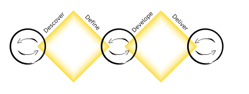
Discover
Research
In my role as a UX designer and researcher for "Innoghte" as a meditation and mindfulness website, I conducted extensive market research to inform our design and content strategy. Here are key insights that shaped our user-centric approach:
1- Target Audience Understanding:
Profiling primary and secondary target audiences, such as stress relief seekers, mindfulness enthusiasts, beginners, and those interested in personal growth, allowed us to tailor our offerings effectively.
2- Competitor Landscape:
In-depth competitor analysis revealed strengths, weaknesses, and content strategies of other meditation platforms. This helped us identify opportunities for differentiation and improvement.
Design
Iteration Process
Enhancing User Experience and Accessibility
During this project, I recognized the importance of an iterative approach to continually improve the user experience and accessibility of Innoghte website. Here's how the iteration process unfolded:
1. Design Refinements:
Based on the user feedback and research findings, I initiated design refinements to address identified issues. This included adjustments to the login process, error messaging, and navigation.
2. Accessibility Validation:
Accessibility compliance was rigorously tested in each design iteration to ensure that the website met the required standards and catered to users with disabilities.
3. Documentation and Knowledge Sharing:
I documented each iteration, recording the changes made, rationale behind them, and their impact on the user experience. This documentation facilitated knowledge sharing within the team and stakeholders.
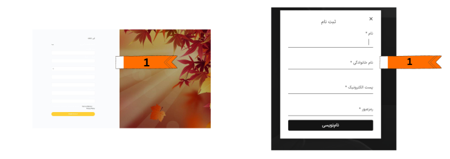
Existing: The boxes on the registration page have no titles
Proposal: A suitable title was placed for each box
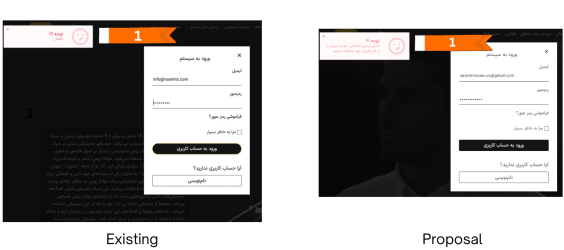
Existing: the login box of the website, in case of an error, only the error message was shown without mentioning the type of error
Proposal: If an error occurs, a message will appear that shows which data is written incorrectly
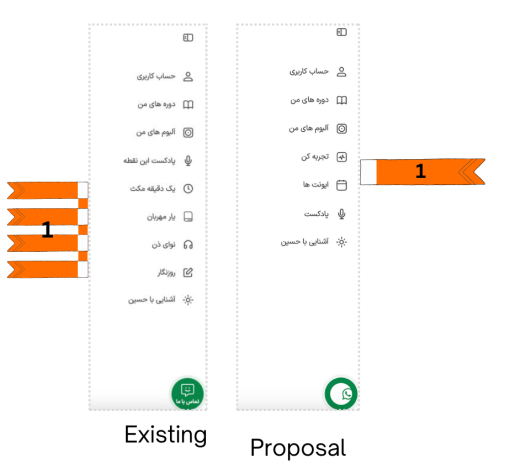
Existing: The naming of different parts of the website was very difficult and sometimes incomprehensible, which caused confusion for the user
Proposal: The proposal to change the names to titles that are more familiar to the user and suitable for the concept of the service, and the users can access what they need more easily and quickly.
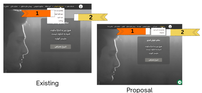
1- Existing: Free services and purchasable products were not separated
1- Proposal: Placing all the products that are sold on the website in a separate section with the name of the products
2- Existing: Placing the shopping cart and payment in the submenu that was not easily accessible
2- Proposal: Using the shopping cart icon in the header.
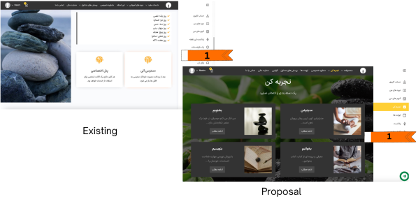
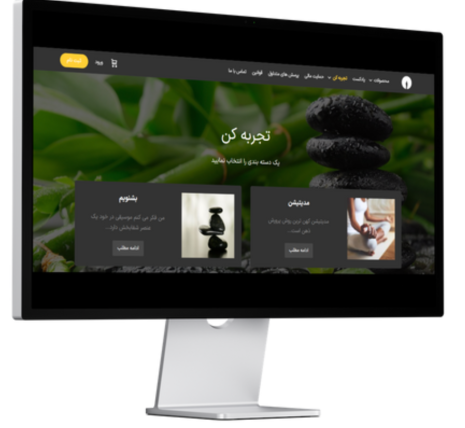
Existing: The free website services had incomprehensible names and were not in the dedicated section
Proposal: Allocating a section called "Experience" for free services with subsections with simpler and more familiar names.
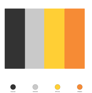
In order keep consistency we specified the color palette of the website and in our design and proposals we followed them
Color palette:
What did I learn?
The redesign of this website was the best time to work closely with the developer and several stakeholders. Considering that we had to present the proposals in the meetings, it is necessary to prepare files and documents before and after the design. Also, we should have shown why website design has not been easy for users and how we can help improve the user experience.
See more of my work