Peachy AI Skincare Application

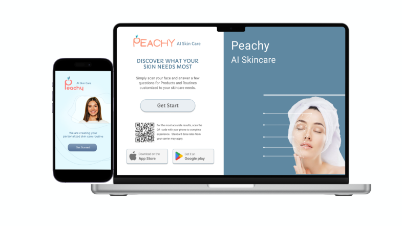
Designing an application for an AI Skincare was one of the student assignment we had in UX-Land school. In a team of three, we were assigned to design an adaptive website for both mobile and desktop devices focusing on User Interface aspect.
Project Overview


Role
Team
Time Scope
Tools

Methods
UX/UI Designer
Project Manager
Group of 3
3Months
Figma
Illustrator
Google meet
Zoom
Photoshop
Canva
Maze
Miro
Survey
User Interviews
Affinity Mapping
Persona
User Journey
Competetive analysis
Card Sorting
Sketching
Wireframes
Prototyping
Usability Testing
Heuristic evalustion
A/B Testing
As a project manager and UX/UI designer, I was responsible for coordinating meetings and deadlines and placing the required frames and workplaces in Figma before performing each task and ensuring that all the tasks and data required by the project are collected and recorded.
These were the topics that our team finally considered to start the project:
A. Create an intuitive and visually appealing user interface.
B. Implement AI algorithms for skin analysis and product recommendations.
C. Enable virtual try-on features for makeup and skincare products.
D. Ensure data privacy and security for user information.
E. Enhance user engagement and satisfaction.
Objectives
Target User
The application is designed to serve both skincare followres and those who are not experienced.
Our Approach
Float surveys to understand skincare problems and why it is difficult to follow their routine.
Interviewed potential users to understand their concerns and needs..
Studies about how AI works and how we can use this feature as facilitator for our uplans.
1.User Priority: User needs guided our design, enhancing the skincare experience.
2.Visual Appeal: Proficient visual design resonates with the target audience and the brand identity.
3.Usability: Streamlined processes and improved organization enhance usability.
4.Mobile Focus: Mobile-first approach ensures responsiveness on various screens.
5.Navigation: Intuitive structure simplifies user navigation.
6.Interactive Prototypes: Viewers can experience the design firsthand.
7.Brand Consistency: Design choices maintain brand identity.
8.User Testing Impact: User feedback drove iterative improvements.
9.Problem Solving: Innovative solutions address design challenges.
10.Design Thinking: Principles guided our approach.
11.Accessibility: Features promote inclusivity.
Our Goal
Design Process
Discover

Reaserch
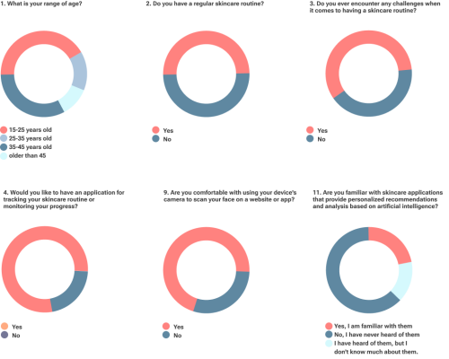
To kick off our research, we created 2 version survey in English and Farsi languages which helped us generate the initial data needed to understand our target audience and their behaviors. We received a total of 127 responses from both surveys.
Key Survey Finding:
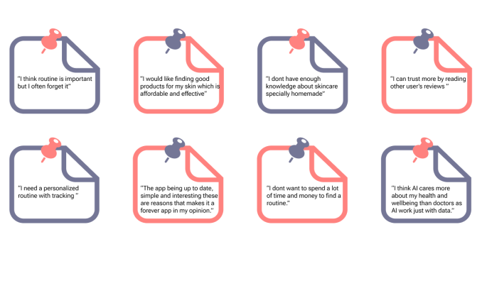
Desatisfaction of dermatologist
Trust in AI feature
Lack of time
Forget their routine
Lack of knowledge about products
Interviews:
* Users Criteria: Users who give a high importance of online skin care.
From 127 participants in our survey we interviews 31 of them.
We selected them according their data in survey such as being familiar with skincare routine,familiar with AI and Apps.
Affinity Diagram Insights
Competitive analysis
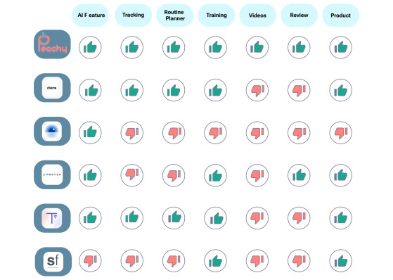
We compared our application with 5 other skincare application/website which all had AI featured and we founded:
1.Almost all of the competitors have:
AI feature
Products
Training
2.Non of them have:
Videos
3.Most of them do not have:
Review
Routine planner
Tracking
After talk with 31 participants in the interview step we understood the most important and common problems that people have in their skincare routines.
Define
Key Interview Finding:
Personalized Skincare: Discuss how AI can analyze individual skin types and conditions to create personalized skincare routines.
Skin Analysis: Explain how AI algorithms can assess skin conditions, including acne, wrinkles, and dark spots, using images or data from various sources.
Customer Engagement: Discuss the role of AI in enhancing customer engagement through chatbots, virtual beauty advisors, and product reviews.
Consumer Education: Emphasize the importance of educating consumers about AI skincare technologies and how to use them effectively also about skincare products.
Survey:
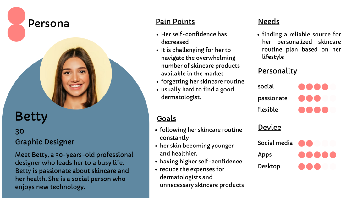
At the end of our research and by using all data we created a persona, Betty.
Betty is a 30-years-old professional designer who leads her to a busy life. Betty is passionate about skincare and her health. She is a social person who enjoys new technology.
Persona
Upon thorough analysis of all our research data, we gained a comprehensive understanding of the challenges associated with our project and attempted to address them by incorporating a solution into our design.
Challenges and Solutions
Personilized skincare routine
Consider efficient questions for user habits and life styles in order to personalize their routine
Lack of time
Users have their dermatologist by their side using the features of skin analysis and skin care advice, so they don't need extra time to go to the doctor and look for a suitable product for their skin.
Forget the routine
The app helps users to track their daily skincare routine
offline.
Lack of knowledge about products
1-The app can find the problem & give a solution with recommend
some products from
famous brands based on skin types & lifestyles.
2-The app Introduces handmade products for those users who
want to use organic materials.
Challenges
Solutions
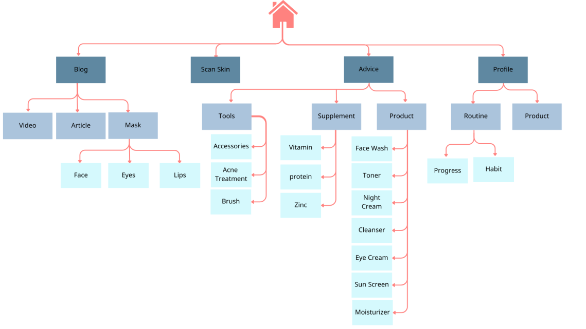
Site map
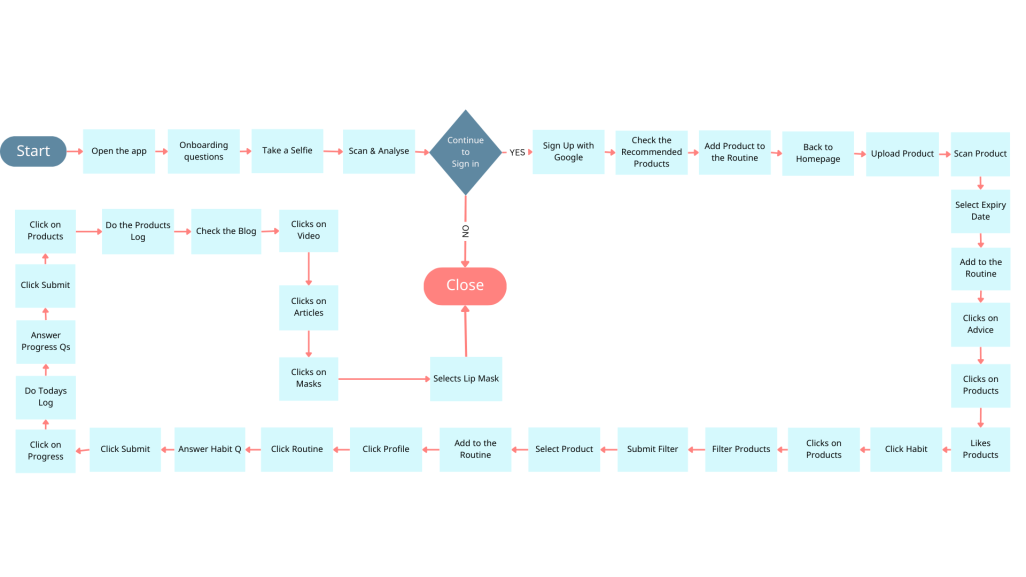
Journey Map
Develop
Information Architecture
Card sorting
We did two types of Card Sorting
1-open card sorting: participants could sort cards in any category and there was not an spacial label or group.
2-closed cart sorting:we considered several categories and ask participants to sort card just there, if they couldn't find a suitable group for a card they also could offer a new one
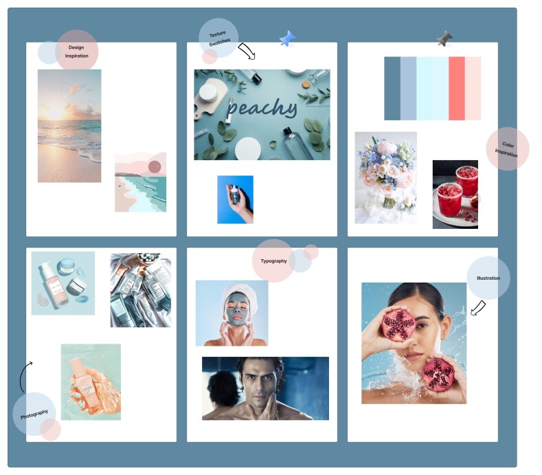
Moodboard & Colors
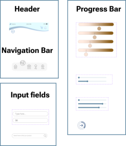
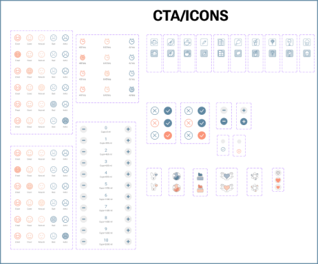
Design System & UI Kit
Low & Mid Fidelity Sketches
Design Iteration
Accessibility Testing
Colorblind Testing:
Typeface & Color Testing:
According to our research reaching up 70 or higher is a good number (from 108) for typeface and color Accessibility So every time our team redesigned the app we tried to increise the number to reach the highest point as much as possible and by the end we got 99 in test which is a good number.
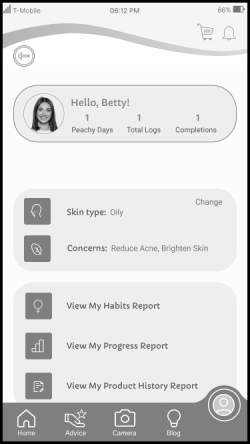
As we know some of the people can not see colors the way that others can so it might cuse some troble in accesssibility for them.In order to cover all types of them( monochromatism, dichromatism, and anomalous trichromatism)
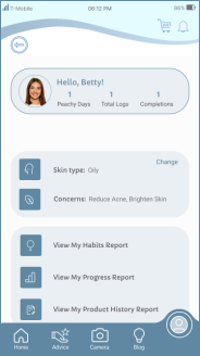
we tested a black and white version to be sure of having the highest accessebility.
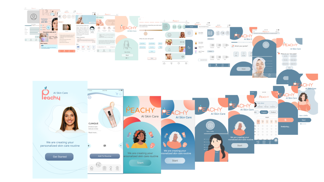
In pursuit of design excellence, our team conducted 3 A/B tests as part of this project. These tests played a crucial role in refining the user experience and making data-driven design enhancements. They were instrumental in shaping the final website design, showcasing our commitment to user-centric design and continuous improvement.
Considering the users with various visual disability, we tried to design accordingly. Below are the screenshots considering the “Color Blinds”.
Design base on WCAG
A/B Testing
Deliver
Based on the card sorting, the first version of the information architecture was made.
However through out the design process, user testing and the competitive analysis, the final version of the information architecture was build.

We drew low and mid fidelity sketches to better show concepts and implement ideas

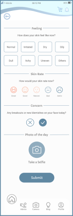
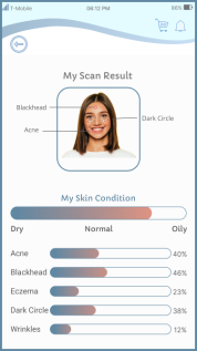

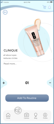


A
B



Test
Final Design
Even though Design process is always evolving based on how human behavior and needs change over time, this is the point we agreed to call it “Done”.
What did I learn?
Making a good balance of users' needs and stakeholders' marketing strategy in mind while designing.
Effective communication with team members and lead challenging situations.
How to design a website from complete scratch.
My first student project exposed me to the importance of understanding users' needs at every stage of the design process. The best way to gain this overview is by keeping track of all research findings and referring to them continually.
It was interesting to discover that I enjoyed interaction design the most, and I'll continue to develop this skill in the next projects.
What can we do next?
Now we are sure that the application is almost done, our team performed several usability testing and ready to delever the application to developer,and as I have learnt a digital product is an onging process.
continuosly gatering feedback and making user-centered imperovement will help a designer to creat an application that evolves with user's needs and expectations. So we can do these steps to improved our design:
Analyze Testing Results: Review feedback from usability tests and identify common issues.
Iterate Design: Make targeted design improvements based on test findings.
Gather User Feedback: Collect feedback from potential users who haven't tested the app.
Ensure Accessibility: Conduct an accessibility audit and fix any barriers.
Optimize Performance: Improve app speed and responsiveness.
Cross-Platform Testing: Test on various devices and OSs.
A/B Testing: Experiment with design elements or features.


